
-collage-
-pre-work-
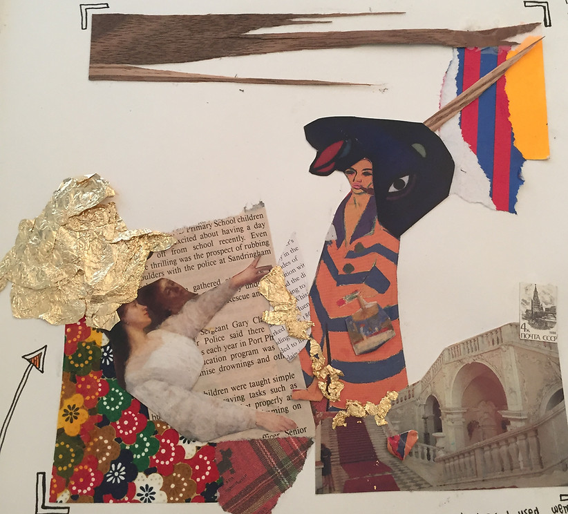
This is the first collage that I made. The purpose of this collage was to make use of different materials and mediums and test out how they work together. For example, we had to test our rough objects next to smooth ones, or bright/glossy pictures next to vintage ones. This experimentation phase would help us determine which styles of collage work better with each other and help us compose our future pieces.
The collage on the left has quite a deep meaning to it which I was developing as I was putting it together. At first I had just gathered many different materials and only thought of its composition once I had placed it all in front of me.
On the left hand side there is a women full of riches who is trying to save her future self from losing herself. I think this idea was based on past literature or even experiences that I have had. I know that it not uncommon for those with 'everything' in terms of money realise how meaningless their life is and rebel against their finances. I think that this general subconscious idea affected my composition ideas as well. One woman has her head full of riches (the gold leaf) and the other is covered with unhappiness.
You can see the 'rich' girl trying to save her future self with money as that is the only thing she thinks can help. Instead this is having the opposite affect and the money is just falling away.
Another composition idea was to have the 'tramp' like woman in front of the red carpet which I found was quite ironic. Moreover this theme affected my colour choices. I though the top right corner should be more bright and match the clothing of the 'future' woman, and then the bottom left corner is the rich woman.
When I initially made this collage, I was quite happy with it and I liked most of the ideas. There were definitely some things that I knew weren't working together but I couldn't identify them. I loved working with the gold leaf and was sure that I would use it in my future work as well.
After meeting Joe Keys, my ideas on collage changed drastically. Now that I look at my initial collage I am quite embarrassed on how many different materials I used. I should have made it more minimalist and powerful. I am proud of how my skills have developed since then. This is thanks to collage artist Joe Keys and his advice.
-joe keys-


Joe Keys is a collage artist who is in his final year of his art degree. He is part of a band and creates the art visuals for their albums and t-shirts. Furthermore, he gets commissioned by other bands who see his work. As an artist he prefers to be given design specifications when provided with a task. This makes it easier for him to make multiple drafts with a central idea. Otherwise he finds it a waste of time to 'guess' what the band would like.
Collages
Joe decided to become a collage artist as he has an interest in different mediums and textures and felt that using them were the best way for him to express his controversial thoughts.
When making collages Joe considers different textures and experiments with them. In his art he uses a lot of white space. He uses many different materials but keeps the background plain. He also uses pen line to create interesting compositions. When he is finding materials to use, he sometimes sees two things that fit perfectly together in his mind, and brings it to life. His work has some elements of symmetry to them, but he always adds something a little 'off' to make the work more interesting.
Joe believes that simple ideas are the best. One of his current favourite ideas is showing thoughts coming out of a head, as though the thoughts are on display. As a viewer we do not know what the thoughts are but we can make assumptions. Another form of collage that he enjoys making is cutting two different faces and adding them together. This displays the idea of bringing two stories together and showing the thoughts of others. Joe enjoys the theme of transparency when it comes to thoughts. He says that as an artist he sometimes thinks of the story of the artwork after making the collage.
Materials
Joe's favourite material to use is old magazines because of their vintage feel. He believes that collages are all about their texture. The magazine that he uses the most is the 'Picture Post' magazine. He uses the images from the magazine to create beautiful art. Using the 'Picture Post' magazine is quite a controversial topic between his peers. This is because this magazine is considered as an artefact of the past to others (contains articles about the World Wars), and his peers believe that they shouldn't be used. On the other hand, Joe believes that old things have a different look to them, and he can use these valuable magazines to create beautiful art.
Joe also emphasised that although he is a collage artist, he still needs to continue practicing his drawing and painting.
Inspiring Artists
The first art exhibition that Joe went to that inspired him was one of Egon Schiele and Jenny Asbl;s work. Here are other artists who have inspired him over time:
-
Tintin Cooper
-
weaves in face
-
makes a collage from just one photo (makes copies)
-
texture of actual weave
-
-
Nicholas Ballesteros
-
makes heads
-
provides no context
-
political undertones?
-
-
Lubinas Himid
-
uses words to convey her message
-
-
Thomas Baryle
-
weaves images together
-
-
Hajra Waheed
-
collects and uses many different materials
-
-
Lesley Hilling
-
more assemblage type of art
-
3D collage
-
-
-response to joe keys-
After meeting with Joe, I decided that my next two collage pieces would focus on using white (or in this case black!) space. This is emphasising the idea that sometimes 'less' is 'more'.
For the first collage on the right, I knew that I wanted to use the gold leaf. The pattern on the bottom was part of a magazine and I cut out the design as I liked the composition and colour. I thought that the two shades of gold were complementing each other very well. I also found the tags that I found really interesting. There were two long tags and so I ripped one at its seam so that the collage would not be too crowded.
I liked the title 'white stuff'' because there was nothing white on the tile. I used white acrylic paint to add a little white around the actual word 'white'. Moreover, I liked how the bottom looked like waves which reminded me of water and a stream. That's why I have a little white stream coming out of the white stuff. I think that this element added to the 'story' of the piece and gave some composition. This collage is definitely different to my other work as it minimalist with a simple idea. I enjoyed experimenting with this technique.
For my second collage I decided to make it even more minimalistic. To achieve this I found a stamp that I really liked. It's of two bears, one in front of the other. I found the composition quite striking and felt that it conveyed love and trust. I decided to find newspaper clippings of two people in the same positions (preferably a man and woman to convey love). I found a man and a woman in an old newspaper ( I wanted to create something vintage as well). I really liked it how the two people in the photo had stern expressions on their faces which weren't conveying the same love as the animals. This was done purposefully to show that animals convey more love to others than humans.


My Keys pointed out that he and Joe really liked how I had created a 'frame' with the newspaper clippings so that there was a point of focus. Moreover, I think that my choice of adding a little purple helped make the piece a bit more interesting.
Overall, I think that I learned a lot more about the fundamentals of art than I thought I would from just one session with Joe. He really helped me realise that collages do not always have to be crowded and busy, but sometimes the simpler ones are the most powerful. I am really grateful for this first hand experience with an artist as I came back with a great range of learnings. I know for sure that I will use this idea of 'less', not only in my collage but my future artwork as well.
-inspiring artists-
John Stezakar
I really like the simplicity of John Stezakar's work. I think that you have to have a really good idea to see pictures of nature and associate it with body parts. Even though some photos do not directly correspond to some images
Initial Response
When I first say John Stezakar's work on our art website I found it very intriguing as I could not comprehend how he hand found a landscape that matched two faces so perfectly. When I looked at his work I had a feeling of satisfaction as the two images worked together so well. Oddly enough, I also had a feeling of unease as I couldn't understand how something so simple could be a collage and how it could have a meaning behind it.
I decided to look at Stezakar's work more thoroughly as it resonated with my idea of simplicity in collage. Instead of sticking lots of images together like is done in conventional collages, Stezakar's work was different. I love how simple yet interesting Stezakar's work is. It looks so easy to make yet I am sure that it takes a lot of skill to see which image works with another. This is especially the case for his work where the two images do not explicitly look like they will work together.
I also love how the pictures of the people are vintage. This reminds me of old movies or an old music video in which editors have just stuck a picture of nature over the face to show their editing skills.
Contextual Understanding
John Stezakar is one of leading artists in photographic collage and appropriation. He uses old photographs, films stills and vintage postcards to create collages. Something interesting that John once said is that "the images find him, he does not find them". This emphasises how experienced he is in making these type of collages. He overlays distinct images to make new scenes.
In his Marriage series, Stezaker focuses on the concept of portraiture, both as art historical genre and public identity. Using publicity shots of classic film stars, Stezaker cuts and overlaps famous faces, creating hybrid ‘icons’ that dissociate the familiar to create sensations of the uncanny. Coupling male and female identity into unified characters, Stezaker points to a disjointed harmony. By using stylistic images from Hollywood’s golden era, Stezaker engages with his interest in Surrealism.
What drew me to his work specifically is how simple the collages are yet they still are very interesting. Personally, I enjoy studying his work as I like to imagine the process he went through to find the specific images he uses. Moreover, I like how almost all of his work has a specific look to it so that whenever I would look at his art, I would know its his. What intrigues me the most about Stezakar is his eye for putting scenery and faces together. I want to use this idea of simplicity in my own work.
Tintin Cooper
Tintin Cooper is a Thai-English artist who is famous for her collages and light image installations.
The themes of her work often include ideas of masculinity and how we perceive men should be. She breaks up these notions by blurring out the the faces of men in collages.
Technique:
What Tintin Cooper does is take two copies of one image. She cuts horizontally against the first image so that there are slits in it. She then does the same thing to the second image, this time cutting vertically. This way she can weave the slits of paper into each other. What I really like is how 'impromptu' her work is. Sometimes she doesn't weave the whole strip or sometimes she just lets it hang out.
I am going to use this technique as part of my final piece as can be seen below. I will also elaborate on her process.


-obssession-

The central idea for my piece will be that our mind is clouded when we are obssessed.
-response to tintin cooper-
I loved this type of collage because Tintin Cooper only uses one image and makes a collage out of it. I really like it how she only blurs out the face.
For part of my obsession idea, I want to say that you cant think clearly with your head and so maybe I can weave that part to show that it is not crisp. This creates a distorted look to show that the thoughts in his mind are distorted. When we are obsessed we can only think about one thing and focus on our emotions instead of being rational.
Process:
Initially, I wanted to make a ’vintage’ art piece and so I tried finding old magazines with women on the cover. I was not able to find any, but instead found a very modern magazine with an image of a woman. I was immediately attracted to the colors on the magazine as well as to her facial emotion of being lost. I decided that I would use this image to replicate Tintin Coopers technique. I first made several copies of the original image. I cut one of the images into vertical strips. I carved horizontal into my original piece so that I could weave in the horizontal strips. I only weaved the upper face as that is the part that is not able to think clearly when we are obsessed. I think this simply conveys the idea of not thinking clearly when we are obsessed.


Weave Texture
Mr Keys told me that one thing that stood out to him about Tintin Cooper's work as that the texture of the weave was so interesting and appealing. Once I finished my collage I had the choice to scan it so that the final piece would be a smooth surface, or keep the weave texture.
I decided to keep the weave texture as I personally feel that it was the most intriguing part of the image. I am really happy with this decision because the weave texture really brings life to the collage. Moreover, it emphasises how disoriented the mind is when we are obsessed. It is small decisions like this which really bring accross an artists intent.
Background
Once I completed the collage I had a choice on how I wanted to display it. I could place it in a frame, mount it on a board, use different colour backgrounds, etc.
Mr Keys brought out some wood patterned papers. We found that the colour went well with the girls skin tone and so the wood would complement the picture. Still, I wasn't very satisfied with this and realized I wanted something that was a little 'shocking'.
What intrigued me about the picture in the first place was the dark blue lipstick on the woman. I decided to take this dark blue colour and use it as a background for my collage. I think that it ended up complimenting the lips and helping them stand out. I wasn't too sure about this decision, but am really happy with it now. I think it look especially nice to have the blue border near black, like I photographed for my main piece.
Mounting
Mounting the collage onto the blue paper was a new experience for me. Usually it is Mr Keys who does this for us. I was quite nervous as my piece was quite fragile (the cuts in the sheet made it very flimsy). I used spray glue to stick my image flat. An advantage to using spray glue is that you can rearrange the photo once you have initially glued it on. Unfortunately, I didn't have this advantage as my collage was so fragile, once it was stuck it would have to stay there. I think that for my first attempt, I did well. The image was placed a little crooked, so I had to cut my border so that it would align with the image.
'Deleted' Sign
When I was choosing my image for the collage, I wasn't sure if I should have used the magazine cover I did. This is because it had a sticker on it which said 'deleted'. At first I tried to scrape it off. As you can see the I was successful with the bottom left corner. As I start to peel the sticker away, I realised that I actually wanted to keep it. This is because the word 'deleted' located right below the neck resembles the fact that we delete everything that our body is telling us and just think from our mind. There is actually a specific quote for this "obsessed from the mind".
I think that keeping the sign was a good idea as it also encourages the audience to look at it and try to figure out the meaning.
This was the first step in which I had to cute vertical strips of the image. This would be the copy of the image which I would use for the actual weaving. For the he other copy of the image, I used an 'exacto knife' to cut horizontal strips. To do this effectively, I did not cute from the edge of the paper to the other edge or else I would just get more strips. Instead I left gaps at the bottoms so that the picture would not fall apart.

The cuts did not reach the edge of the image
Overall, I am really happy with how this unit turned out. I got insight into a different perspective of collage and artwork in general. I think that my final piece on 'obsession' was really simple which made it effective. I have always wanted to try something different and this was my chance. Obsession is when we cannot think straight and my piece conveyed this.